

Christmas Card
ANDY WARHOL
Before he was Andy Warhol, Andrew Warhola was making a living as a commercial illustrator in 1950’s New York. He drew shoes for magazines and manufacturers, designed book covers for pulp novels and record covers for weekly hits and, in the role that allowed him the most bounds for experimentation, he created greeting and holiday cards for Tiffany and Co, as well as the MOMA. It is unsurprising, to know Warhol as we do today, that he always loved Christmas. He was a devout man, and charitable throughout his life, but something of the kitsch, Americana of contemporary Christmas festivities spoke to him and the designs he made for Christmas cards become his most popular. Using a unique technique of blotting ink and then tracing hard outlines on a new sheet of paper lowered atop the original, Warhol’s distinctive style of the day lent itself to festivities. His illustrations are warm and playful, full of character while retaining a remarkable simplicity in their style. It was not long before his genius was noticed, and he dropped the ‘a’ of his last name to become the artist we know today, but in these early, commercial works, we can see so many of the technical and contextual components that led to his maturity.
Andy Warhol
ANDY WARHOL, c.1951. BLOTTED INK AND FOUNTAIN PEN ON PAPER.
Before he was Andy Warhol, Andrew Warhola was making a living as a commercial illustrator in 1950’s New York. He drew shoes for magazines and manufacturers, designed book covers for pulp novels and record covers for weekly hits and, in the role that allowed him the most bounds for experimentation, he created greeting and holiday cards for Tiffany and Co, as well as the MOMA. It is unsurprising, to know Warhol as we do today, that he always loved Christmas. He was a devout man, and charitable throughout his life, but something of the kitsch, Americana of contemporary Christmas festivities spoke to him and the designs he made for Christmas cards become his most popular. Using a unique technique of blotting ink and then tracing hard outlines on a new sheet of paper lowered atop the original, Warhol’s distinctive style of the day lent itself to festivities. His illustrations are warm and playful, full of character while retaining a remarkable simplicity in their style. It was not long before his genius was noticed, and he dropped the ‘a’ of his last name to become the artist we know today, but in these early, commercial works, we can see so many of the technical and contextual components that led to his maturity.

Stockholm (Grey Ground Abstraction)
ANDREAS FEININGER
Feininger was not interested in people. A pioneer of modern photography, both as an artist, a writer, and an educator, almost none of his thousands of images are of humans. Instead, he captured cities, skylines, and the natural world. To look at his images is to see a flattening between these two seemingly exclusive realms. Close up, almost abstract images of shells, bones, plants and minerals seem to speak the same language as his moody, atmospheric, and often revealing images of Manhattan or, as this image is from, Stockholm. Training first as an architect, he worked at the Bauhaus where his neighbour was Moholy-Nagy, one of the founding fathers of the modern photograph. He took up the camera and never looked back, yet his architectural training is evident in everything. This abstraction of the Stockholm ground looks like a work of urban planning run wild, as much as it does some unknowable natural form. Feininger saw buildings, cities, and modernity as something not against the natural world but altogether in dialogue with it.
Andreas Feininger
ANDREAS FEININGER, c.1935. GELATIN SILVER PRINT.
Feininger was not interested in people. A pioneer of modern photography, both as an artist, a writer, and an educator, almost none of his thousands of images are of humans. Instead, he captured cities, skylines, and the natural world. To look at his images is to see a flattening between these two seemingly exclusive realms. Close up, almost abstract images of shells, bones, plants and minerals seem to speak the same language as his moody, atmospheric, and often revealing images of Manhattan or, as this image is from, Stockholm. Training first as an architect, he worked at the Bauhaus where his neighbour was Moholy-Nagy, one of the founding fathers of the modern photograph. He took up the camera and never looked back, yet his architectural training is evident in everything. This abstraction of the Stockholm ground looks like a work of urban planning run wild, as much as it does some unknowable natural form. Feininger saw buildings, cities, and modernity as something not against the natural world but altogether in dialogue with it.
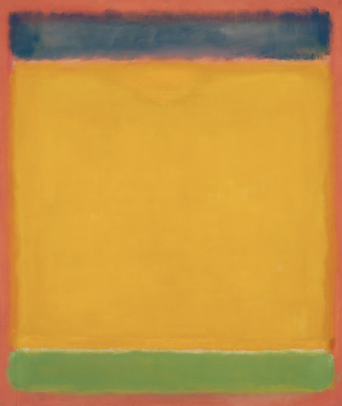
Untitled (Blue, Yellow, Green on Red)
MARK ROTHKO
Having studied under the father of Color-Field painting himself, Josef Albers, Mark Rothko took the genre in new and staggering directions. Applying thin layers of diluted oil paint, painstakingly slowly so as to build up soft hues on the canvas such that the works are almost luminous in their color, Rothko wanted to control the viewer on a carnal level. He removed the intellectualism of Albers and many of the abstract expressionists around him. Instead, he didn’t want the viewer to try and rationalise the work or any feelings it provoked - Rothko tried to find an innate, visceral science to color that when executed in tandem and relation to each other, as seen here, could bring the viewer on a preset journey of emotion. It is for this same reason that almost all of his works were unnamed - any context outside of the experience of viewing them felt unnecessary and could detract from the deeply human experience of hues and shades affecting oneself.
Mark Rothko
MARK ROTHKO, 1954. OIL ON CANVAS.
Having studied under the father of Color-Field painting himself, Josef Albers, Mark Rothko took the genre in new and staggering directions. Applying thin layers of diluted oil paint, painstakingly slowly so as to build up soft hues on the canvas such that the works are almost luminous in their color, Rothko wanted to control the viewer on a carnal level. He removed the intellectualism of Albers and many of the abstract expressionists around him. Instead, he didn’t want the viewer to try and rationalise the work or any feelings it provoked - Rothko tried to find an innate, visceral science to color that when executed in tandem and relation to each other, as seen here, could bring the viewer on a preset journey of emotion. It is for this same reason that almost all of his works were unnamed - any context outside of the experience of viewing them felt unnecessary and could detract from the deeply human experience of hues and shades affecting oneself.

Heavy Industry
ED RUSCHA
Random phrases become mantras, and simplicity becomes confusing. This is at the heart of Ed Ruscha’s genius: an ability to use typography and paint to elevate words into something considerable. Heavy Industry is inherently vague; painted on a used canvas rotated ninety degrees, where the ghosts of previous words are scarcely visible through thick brown paint, it provides no answers, and asks no direct questions and yet leaves the viewer with an unshakeable sense that something is being said. The industry in question is not explicit, it’s weight is up to us to decide and so Ruscha is able to use the vernacular and tactics of advertising to, by removing the context, force us to focus on linguistics and meaning in a way that explicit commercialism is not able to. Ruscha changed his typeface to suit the words, and here, in heavy, almost gothic, serifed font, the painting seems to inhabit the very phrase it proclaims - every element speaks to ‘Heavy Industry’, while leaving it entirely up to us to decide what that means.
Ed Ruscha
ED RUSCHA, 1962. OIL AND PENCIL ON CANVAS.
Random phrases become mantras, and simplicity becomes confusing. This is at the heart of Ed Ruscha’s genius: an ability to use typography and paint to elevate words into something considerable. Heavy Industry is inherently vague; painted on a used canvas rotated ninety degrees, where the ghosts of previous words are scarcely visible through thick brown paint, it provides no answers, and asks no direct questions and yet leaves the viewer with an unshakeable sense that something is being said. The industry in question is not explicit, it’s weight is up to us to decide and so Ruscha is able to use the vernacular and tactics of advertising to, by removing the context, force us to focus on linguistics and meaning in a way that explicit commercialism is not able to. Ruscha changed his typeface to suit the words, and here, in heavy, almost gothic, serifed font, the painting seems to inhabit the very phrase it proclaims - every element speaks to ‘Heavy Industry’, while leaving it entirely up to us to decide what that means.

Belshazzar’s Feast
REMBRANDT
A great Babylonian king named Nebuchadnezzar looted the Temple of Jerusalem and took the holy artefacts as his own. Hist son, Belshazzar, hosts a feast and uses the golden cups from the temple as receptacles for wine and merriment until the hand of God appears and inscribes in the wall in an cryptic script. While in the Old Testament text, the script is suggested to be Aramaic, here Rembrandt uses Hebrew. At the time of this painting, he was living in the Jewish Quarter of Amsterdam and took the text from the book of a close friend and Rabbi of his. But Rembrandt alters it, rearranging the characters into columns and incorrectly transcribing a letter to retain a sense of illegibility to the message. As the story goes, Belshazzar and his party of party of high society Babylonians could not decipher God’s message and had to call upon Daniel to help. The message, both in the bible story and in Rembrandt’s description reads: “God has numbered the days of your kingdom and brought it to an end; you have been weighed in the balances and found wanting; your kingdom is given to the Medes and Persians”.
Rembrandt
REMBRANDT, c1637. OIL ON CANVAS.
A great Babylonian king named Nebuchadnezzar looted the Temple of Jerusalem and took the holy artefacts as his own. Hist son, Belshazzar, hosts a feast and uses the golden cups from the temple as receptacles for wine and merriment until the hand of God appears and inscribes in the wall in an cryptic script. While in the Old Testament text, the script is suggested to be Aramaic, here Rembrandt uses Hebrew. At the time of this painting, he was living in the Jewish Quarter of Amsterdam and took the text from the book of a close friend and Rabbi of his. But Rembrandt alters it, rearranging the characters into columns and incorrectly transcribing a letter to retain a sense of illegibility to the message. As the story goes, Belshazzar and his party of party of high society Babylonians could not decipher God’s message and had to call upon Daniel to help. The message, both in the bible story and in Rembrandt’s description reads: “God has numbered the days of your kingdom and brought it to an end; you have been weighed in the balances and found wanting; your kingdom is given to the Medes and Persians”.

Fantasia in Blue
HANS HOFMANN
Born in the age of Van Gogh, dead in the age of Warhol; across generations, centuries, and continents, the artist Hans Hofmann reshaped the world of art through teaching and painting. Born and educated in Germany, when Hofmann moved to America at the age of 52 he brought with him a deep understanding of and ability to synthesis the disparate movements of the European avant-garde. His show with Peggy Guggenheim not a decade later marked a turning point in the development of American abstraction and further established his reputation as a force of change. Hofmann was seen as an elder statesman in practically every movement of American modernism, not only for his paintings but for his role as a teacher. In Munich, in 1915, he set up what is widely regarded as the first ever school of Modern Art, and he brought it with him to America where his list of students reads as a who’s who of 20th century visual pioneers. Hofmann was rigorous in his beliefs, and his greatest skill as an educator was to teach his students to be rigorous in theirs. He held everyone, including himself, to the highest of artistic standards, understanding that art taken seriously could change the world, and through Hofmann’s tutelage, so many did.
Hans Hofmann
HANS HOFMANN, 1954. OIL ON CANVAS.
Born in the age of Van Gogh, dead in the age of Warhol; across generations, centuries, and continents, the artist Hans Hofmann reshaped the world of art through teaching and painting. Born and educated in Germany, when Hofmann moved to America at the age of 52 he brought with him a deep understanding of and ability to synthesis the disparate movements of the European avant-garde. His show with Peggy Guggenheim not a decade later marked a turning point in the development of American abstraction and further established his reputation as a force of change. Hofmann was seen as an elder statesman in practically every movement of American modernism, not only for his paintings but for his role as a teacher. In Munich, in 1915, he set up what is widely regarded as the first ever school of Modern Art, and he brought it with him to America where his list of students reads as a who’s who of 20th century visual pioneers. Hofmann was rigorous in his beliefs, and his greatest skill as an educator was to teach his students to be rigorous in theirs. He held everyone, including himself, to the highest of artistic standards, understanding that art taken seriously could change the world, and through Hofmann’s tutelage, so many did.

Overcast
CHARLES G. SHAW
Definitions of the abstract are loose. What is an abstraction to one person is figurative reality to another, and the movement of American Abstraction is loosely defined with each practitioner understanding their role and subject matter differently. For Shaw, his ‘Plastic Polygons', as he called them, were not abstractions of the New York architecture but truthful depictions of concrete objects, and he coined the movement ‘concretionism’. The works are pioneering, and helped lay the foundations for so many artists that followed, but he was painting in a time when abstract art of any sense was not fully accepted by the critical vanguard or the commercial collectors. Soft palette and sharp lines create an atmosphere, but the work is mostly unemotional or expressive - instead, they are an attempt to depict the beauty of a rigorous system through form and color. For years Shaw painted in the series, and with each show and painting he moved the dial slowly to create an environment of acceptance to more radical forms.
Charles G. Shaw
CHARLES G. SHAW, c1934. OIL AND OIL STICK ON PAPERBOARD.
Definitions of the abstract are loose. What is an abstraction to one person is figurative reality to another, and the movement of American Abstraction is loosely defined with each practitioner understanding their role and subject matter differently. For Shaw, his ‘Plastic Polygons', as he called them, were not abstractions of the New York architecture but truthful depictions of concrete objects, and he coined the movement ‘concretionism’. The works are pioneering, and helped lay the foundations for so many artists that followed, but he was painting in a time when abstract art of any sense was not fully accepted by the critical vanguard or the commercial collectors. Soft palette and sharp lines create an atmosphere, but the work is mostly unemotional or expressive - instead, they are an attempt to depict the beauty of a rigorous system through form and color. For years Shaw painted in the series, and with each show and painting he moved the dial slowly to create an environment of acceptance to more radical forms.

Solar Music
REMEDIOS VARO
Remedios Varo spend most of the 1930s on the run. First from her native Spain where her outspoken political activism and relationship with a known anarchist artist made her a target for Franco in the rising Spanish Civil War. And then from Nazism in her adopted Paris for much the same reasons. A decade was spent moving from town to town in Western Europe, living a bohemian life of coffee shops, art and destitution with the avant-garde intellectuals of the day. While she was painting throughout, and well regarded for her surrealist works of esoteric magic, it was not until 1941 when she settled in Mexico City that she reached artistic maturity. The work made there is complex and beautiful, as much inspired by the folk practices of Mexico as the European Surrealists and intellectuals she had spent the previous decade with. There are nods to occult magic, and heady psychoanalytical dives into the subconscious which combine to make her work somewhat unclassifiable. It was while in Mexico that she became friends with Leonora Carrington and Kati Horna and, together, they became known as ‘The Three Witches of Surrealism’. Yet the name has always been unjust, as together they elevated surrealist ideas into something more tender and complex, removing the masculine edge parts of the movement had to create a style that feels, even today, singular.
REMEDIOS VARO
REMEDIOS VARO, 1955. OIL ON CANVAS.
Remedios Varo spend most of the 1930s on the run. First from her native Spain where her outspoken political activism and relationship with a known anarchist artist made her a target for Franco in the rising Spanish Civil War. And then from Nazism in her adopted Paris for much the same reasons. A decade was spent moving from town to town in Western Europe, living a bohemian life of coffee shops, art and destitution with the avant-garde intellectuals of the day. While she was painting throughout, and well regarded for her surrealist works of esoteric magic, it was not until 1941 when she settled in Mexico City that she reached artistic maturity. The work made there is complex and beautiful, as much inspired by the folk practices of Mexico as the European Surrealists and intellectuals she had spent the previous decade with. There are nods to occult magic, and heady psychoanalytical dives into the subconscious which combine to make her work somewhat unclassifiable. It was while in Mexico that she became friends with Leonora Carrington and Kati Horna and, together, they became known as ‘The Three Witches of Surrealism’. Yet the name has always been unjust, as together they elevated surrealist ideas into something more tender and complex, removing the masculine edge parts of the movement had to create a style that feels, even today, singular.

Holy Women at Christ’s Tomb
ANNIBALE CARRACCI
Lauded and lusted after by great collectors over millennia, it stayed in the single commissioning family for most of its life, rejecting offers from the King of England for its possession before finding its permanent home in St. Petersburg, Russia, in 1836. Annibale Carracci’s monumental work was an object of desire not simply for its aesthetic beauty or holy reverence but for its position as the synthesis of an era. Carracci is regarded as one of the founders of Baroque, returning to the classical monumentality of early Renaissance masters but adding in a vivid and dynamic lifeblood. Here, he took the styles of the day from across northern and southern Italy and united them into something that felt remarkably new. Classical sculpture, the cartoons of Rafael and the bright Roman frescoes of the 1400s meet in a work that rejected the more naturalistic vogues that Caravaggio was pioneering and brought back a sense of dramatics to religious art that would sustain for the hundreds of years after his passing.
Annibale Carracci
ANNIBALE CARRACCI, 1598. OIL ON CANVAS.
Lauded and lusted after by great collectors over millennia, it stayed in the single commissioning family for most of its life, rejecting offers from the King of England for its possession before finding its permanent home in St. Petersburg, Russia, in 1836. Annibale Carracci’s monumental work was an object of desire not simply for its aesthetic beauty or holy reverence but for its position as the synthesis of an era. Carracci is regarded as one of the founders of Baroque, returning to the classical monumentality of early Renaissance masters but adding in a vivid and dynamic lifeblood. Here, he took the styles of the day from across northern and southern Italy and united them into something that felt remarkably new. Classical sculpture, the cartoons of Rafael and the bright Roman frescoes of the 1400s meet in a work that rejected the more naturalistic vogues that Caravaggio was pioneering and brought back a sense of dramatics to religious art that would sustain for the hundreds of years after his passing.

Talisman Roses
WALT KUHN
A boy from the Brooklyn docks, working at a bicycle repair shop at the turn of the 20th century, set off for California with sixty dollars in his pocket and the dream to create art. Once there, he travelled to Europe and traversed the continent, exploring the fledgling artistic movements and finding himself as an early American voyeur to modernism. Bringing this movement back to his native New York, Kuhn worked to establish a school of American Modernism and in 1913, organised the legendary Armoury Show which established the United States as a consequential player in the new artistic world. Yet as he aged, Kuhn came to the question his loyalty to the modernism he had championed, and found himself between worlds, adrift in the seas he himself had planted. While his earlier work depicted performers, dancers, circus acts and vaudeville characters, his later work came to focus on still lives. There is something in the flowers, their droops and springs, the curves and sharp edges that still carries something of the performer in them. In his moments of calmness, Kuhn still found a part of the energetic, young man seeking new life and experiences.
Walt Kuhn
WALT KUHN, 1935. OIL ON CANVAS.
A boy from the Brooklyn docks, working at a bicycle repair shop at the turn of the 20th century, set off for California with sixty dollars in his pocket and the dream to create art. Once there, he travelled to Europe and traversed the continent, exploring the fledgling artistic movements and finding himself as an early American voyeur to modernism. Bringing this movement back to his native New York, Kuhn worked to establish a school of American Modernism and in 1913, organised the legendary Armoury Show which established the United States as a consequential player in the new artistic world. Yet as he aged, Kuhn came to the question his loyalty to the modernism he had championed, and found himself between worlds, adrift in the seas he himself had planted. While his earlier work depicted performers, dancers, circus acts and vaudeville characters, his later work came to focus on still lives. There is something in the flowers, their droops and springs, the curves and sharp edges that still carries something of the performer in them. In his moments of calmness, Kuhn still found a part of the energetic, young man seeking new life and experiences.

Place Pasdeloup
STUART DAVIS
At the age of 19 Stuart Davis was the youngest artist in the 1913 Armory Show, a turning point in American Modernism. The work he was there, especially those by Matisse, Van Gogh, and Picasso, had a profound effect on him, and for the next decade he was a devotee to the schools of Cubism and Modernism, painting works that fit into the contemporary avant-garde. By the start of the 1920s, however, Davis had developed as a painter and found a signature style quite unlike anything being made at the time. Predating Pop-Art by nearly 40 years, he fused advertising graphics and commercial products with a hard lines and flat expanses of colour in works he called ‘Color-Space Compositions’. To begin, these were limited to still lives and landscapes, but in 1928 he spent a year in Paris where he would travel around the city each day and return home to paint the urban scenes he had encountered. To look at these works today is to feel a familiarity with the style, something harmonious and understandable, but at the time these were radical explorations of art. Davis used foundations of simplicity, reducing spatial perception, to add adornments of complication that reveal hidden details and meaning in every corner.
Stuart Davis
STUART DAVIS, 1928. OIL ON CANVAS.
At the age of 19 Stuart Davis was the youngest artist in the 1913 Armory Show, a turning point in American Modernism. The work he was there, especially those by Matisse, Van Gogh, and Picasso, had a profound effect on him, and for the next decade he was a devotee to the schools of Cubism and Modernism, painting works that fit into the contemporary avant-garde. By the start of the 1920s, however, Davis had developed as a painter and found a signature style quite unlike anything being made at the time. Predating Pop-Art by nearly 40 years, he fused advertising graphics and commercial products with a hard lines and flat expanses of colour in works he called ‘Color-Space Compositions’. To begin, these were limited to still lives and landscapes, but in 1928 he spent a year in Paris where he would travel around the city each day and return home to paint the urban scenes he had encountered. To look at these works today is to feel a familiarity with the style, something harmonious and understandable, but at the time these were radical explorations of art. Davis used foundations of simplicity, reducing spatial perception, to add adornments of complication that reveal hidden details and meaning in every corner.

Untitled
LOUISE NEVELSON
Louise Nevelson’s life was to be a tale of 20th Century immigration, steady progress through social classes, and a domestic life in leafy Mount Vernon, if it were not undone by her bravery and commitment to art. Emigrating from Ukraine as a child to the United States, and marrying into a wealthy family in her early 20s, she was expected to be a socialite wife and home-maker, educated on culture but not so bold as to assume she could create it herself. “Within that circle you could know Beethoven”, she said, “but god forbid you were Beethoven.” Yet she was gifted in a wide field of art, and had longed to be an artist since she was a child so, in 1930, at the age of 31, she separated from her husband, accepting no financial support, sold the diamond bracelet he had once given her as a gift, and returned to Europe alone to absorb the artistic culture of the day. Nevelson would go on to redefine American sculpture, but this small sketch on paper was painted during her time in Europe, its loose lines and relaxed feeling clearly informed by Matisse and Picasso. It is the fledgling work of an artist striking out on their own, still awaiting the medium that will call them, but confident in the strength of their character, and the necessity to speak out.
Louise Nevelson
LOUISE NEVELSON, 1932. GRAPHITE ON PAPER.
Louise Nevelson’s life was to be a tale of 20th Century immigration, steady progress through social classes, and a domestic life in leafy Mount Vernon, if it were not undone by her bravery and commitment to art. Emigrating from Ukraine as a child to the United States, and marrying into a wealthy family in her early 20s, she was expected to be a socialite wife and home-maker, educated on culture but not so bold as to assume she could create it herself. “Within that circle you could know Beethoven”, she said, “but god forbid you were Beethoven.” Yet she was gifted in a wide field of art, and had longed to be an artist since she was a child so, in 1930, at the age of 31, she separated from her husband, accepting no financial support, sold the diamond bracelet he had once given her as a gift, and returned to Europe alone to absorb the artistic culture of the day. Nevelson would go on to redefine American sculpture, but this small sketch on paper was painted during her time in Europe, its loose lines and relaxed feeling clearly informed by Matisse and Picasso. It is the fledgling work of an artist striking out on their own, still awaiting the medium that will call them, but confident in the strength of their character, and the necessity to speak out.

Day One
BARNETT NEWMAN
Forms, shapes, discernible meaning: all of these got in the way of Barnett Newman’s mission. He wanted to create art that so engulfed the viewer, was so inescapable in scale and drama that, without distraction, it tapped into a universal understanding. It was only in this way, he thought, that art could approach the sublime, and the aesthetic could elevate the human spirit to a place of purity. Day One is monumental in size while being close to as simple as possible. Save for the two thin lines of slightly contrasting hues, the work is a color-field painting of orange that seems to burst into your brain with abandon. It is, in fact, those two lines of contrasting hue that give the work its power. Newman called them zips, and their purpose is to animate and elevate the central colour - they are not their for beauty but for utility, to uplift and embolden the reach of a single colour towards that final goal of sublimity.
Barnett Newman
BARNETT NEWMAN, 1951. OIL ON CANVAS.
Forms, shapes, discernible meaning: all of these got in the way of Barnett Newman’s mission. He wanted to create art that so engulfed the viewer, was so inescapable in scale and drama that, without distraction, it tapped into a universal understanding. It was only in this way, he thought, that art could approach the sublime, and the aesthetic could elevate the human spirit to a place of purity. Day One is monumental in size while being close to as simple as possible. Save for the two thin lines of slightly contrasting hues, the work is a color-field painting of orange that seems to burst into your brain with abandon. It is, in fact, those two lines of contrasting hue that give the work its power. Newman called them zips, and their purpose is to animate and elevate the central colour - they are not their for beauty but for utility, to uplift and embolden the reach of a single colour towards that final goal of sublimity.

Riding Donkeys on the Beach
ISAAC ISRAËLS
Visually striking, the three girls and their donkeys are little more than coincidental in this work. Instead, it is a classic of Impressionism in that is more a study of light that of anything so concrete as human figures. Israël captures an essence of summer, and the fact that the girls he painted were real people, children of his friends, does not negate from the universality of his depiction. Nature, childhood, sun, sand, and sea - these are the top line ideas, the qualities that across the globe we associate with the warm months, and with a sense of freedom. Israëls philosophy supports this idea, he believed in painting quickly, never working too hard or too long on a piece lest it began to take on a feeling of laboriousness. Instead, he painting quickly, no more than two hours at a time, in doing so was able to capture a sense of urgency and vitality that can come only with the extreme present.
Isaac Israëls
ISAAC ISRAËLS, c1899. OIL ON CANVAS.
Visually striking, the three girls and their donkeys are little more than coincidental in this work. Instead, it is a classic of Impressionism in that is more a study of light that of anything so concrete as human figures. Israël captures an essence of summer, and the fact that the girls he painted were real people, children of his friends, does not negate from the universality of his depiction. Nature, childhood, sun, sand, and sea - these are the top line ideas, the qualities that across the globe we associate with the warm months, and with a sense of freedom. Israëls philosophy supports this idea, he believed in painting quickly, never working too hard or too long on a piece lest it began to take on a feeling of laboriousness. Instead, he painting quickly, no more than two hours at a time, in doing so was able to capture a sense of urgency and vitality that can come only with the extreme present.

Sea Change
AGNES PELTON
Agnes Pelton left Long Island for a new life in the Southern California desert. The sea change of the title is both a personal and a cultural one, as she felt the visual world moving into heady, metaphysical directions. The work is oblique, its abstract forms are shapely and organic, conjuring up the ebb and flow of water and the curvature of the female form in equal measure. It is unplaceable, framed by architectural details that open onto neither sea nor land but instead a consciousness. Pelton saw the movement of thought in the movement of the tides, of nature, that lapped and retreated in quiet crescendoes before crashing into realisation. Art, she thought, channeled the universal energies around us through color and light, able to be perceived as active being which vibrate like, Pelton said, “the fragrance of a flower [which] fills the consciousness with the essence of its life.”
Agnes Pelton
AGNES PELTON, 1931. SEA CHANGE.
Agnes Pelton left Long Island for a new life in the Southern California desert. The sea change of the title is both a personal and a cultural one, as she felt the visual world moving into heady, metaphysical directions. The work is oblique, its abstract forms are shapely and organic, conjuring up the ebb and flow of water and the curvature of the female form in equal measure. It is unplaceable, framed by architectural details that open onto neither sea nor land but instead a consciousness. Pelton saw the movement of thought in the movement of the tides, of nature, that lapped and retreated in quiet crescendoes before crashing into realisation. Art, she thought, channeled the universal energies around us through color and light, able to be perceived as active being which vibrate like, Pelton said, “the fragrance of a flower [which] fills the consciousness with the essence of its life.”

Non-Objective I
ROY LICHTENSTEIN
In 1920, Piet Mondrian reached his artistic maturity with a style that would redefine the very meaning of art. Thin black lines separating rectangular forms, predominantly white but with scarce bursts of primary colours. It was the realisation of Mondrain’s vision for “pure abstract art… completely emancipated, free of naturalistic appearances’, and was, for many, the pinnacle of abstraction. Yet, 40 odd years later, the American pop artist Roy Lichtenstein paints a Mondrian and, while he changes almost nothing, completely redefines the very nature of abstraction. Lichtenstein’s paints a Mondrian because Mondrian’s signature style was so defined, had such a unique and clear language, that it was able to be generically reproduced. And all that Lichtenstein changes is the addition of two panels of Ben-Day dots as a stand in for solid colour. He abstracts that which is reduced to its most simple, turns a solid block into repetitive disks, removing Mondrian’s artistic conclusion even further away from the naturalistic appearance it was escaping. For all that, the piece works on another, more disquieting level. By co-opting and adapting a style of total abstraction, Lichtenstein undoes the very goal it set out to seek. The piece is no longer abstract, instead it is a representational, photo-realist recreation of an object. The work has been retained, it’s visual success has made it a style, and so it has lost its freedom for it represents above all itself.
Roy Lichtenstein
ROY LICHTENSTEIN, 1964. OIL AND MAGMA ON CANVAS.
In 1920, Piet Mondrian reached his artistic maturity with a style that would redefine the very meaning of art. Thin black lines separating rectangular forms, predominantly white but with scarce bursts of primary colours. It was the realisation of Mondrain’s vision for “pure abstract art… completely emancipated, free of naturalistic appearances’, and was, for many, the pinnacle of abstraction. Yet, 40 odd years later, the American pop artist Roy Lichtenstein paints a Mondrian and, while he changes almost nothing, completely redefines the very nature of abstraction. Lichtenstein’s paints a Mondrian because Mondrian’s signature style was so defined, had such a unique and clear language, that it was able to be generically reproduced. And all that Lichtenstein changes is the addition of two panels of Ben-Day dots as a stand in for solid colour. He abstracts that which is reduced to its most simple, turns a solid block into repetitive disks, removing Mondrian’s artistic conclusion even further away from the naturalistic appearance it was escaping. For all that, the piece works on another, more disquieting level. By co-opting and adapting a style of total abstraction, Lichtenstein undoes the very goal it set out to seek. The piece is no longer abstract, instead it is a representational, photo-realist recreation of an object. The work has been retained, it’s visual success has made it a style, and so it has lost its freedom for it represents above all itself.

Orchestra
MAN RAY
For an exhibition in 1917, Man Ray made a series of ten collages that he framed and installed on a rotating pole, moveable by the audience, and called ‘Revolving Doors’. The works are geometric abstractions, bright and playful in nature they combine machine like, rigid forms with a loose human touch that brings a musicality to their composition. The works were not well received on their debut, too colourful for those collectors used to the muted palettes of Cubism and lyrical, serious abstraction. The original collages and their revolving stand were destroyed but years later, Ray reproduced the works as a series of prints, such as the one here. Viewed together, they tell a cohesive story of movement and a hopeful modernity but alone, we are able to focus on the formal components. The work is proto-color theory, a study in shades and their interactions, but it also touches on the same themes that Ray returned to throughout his career, a visual depiction of music. The sensual shape of instruments are reduced into geometric purity and the work can almost be heard through the interplay of shape and color.
Man Ray
MAN RAY, c.1916. POCHOIR PRINT WITH INK ON PAPER.
For an exhibition in 1917, Man Ray made a series of ten collages that he framed and installed on a rotating pole, moveable by the audience, and called ‘Revolving Doors’. The works are geometric abstractions, bright and playful in nature they combine machine like, rigid forms with a loose human touch that brings a musicality to their composition. The works were not well received on their debut, too colourful for those collectors used to the muted palettes of Cubism and lyrical, serious abstraction. The original collages and their revolving stand were destroyed but years later, Ray reproduced the works as a series of prints, such as the one here. Viewed together, they tell a cohesive story of movement and a hopeful modernity but alone, we are able to focus on the formal components. The work is proto-color theory, a study in shades and their interactions, but it also touches on the same themes that Ray returned to throughout his career, a visual depiction of music. The sensual shape of instruments are reduced into geometric purity and the work can almost be heard through the interplay of shape and color.

The Return of the Prodigal Son
REMBRANDT
Approaching death, the greatest painter of his age leaves us with a final word of hope for forgiveness and salvation. A son, wretched and wasteful has spent the fortune his father gave him on frivolity and decadence and returns home begging for a lowly position to redeem himself, but is instead welcomed in open arms and embraced not for his sins but his penitence. This is the story that Rembrandt - master painter, portraitist and hero of the Dutch golden age - depicts as amongst the final works before he passes away and it is hard not to read it as a plea for how he will be treated in the afterlife. He does not represent it with biblical accuracy, but brings in unknown characters: a women, barely visible, most likely his mother and a seated figure representing a tax collector and his own ambivalence at the wealth he has built. Rembrandt is both the young son, coming home ashamed, and the older son, dissatisfied with the lack of reward for his loyalty in contrast to his brother. Both need salvation, both hope to come home and both, as Rembrandt, long for the embrace of a loving father to forgive them for the life they have led.
Rembrandt
REMBRANDT, c.1668. OIL ON CANVAS.
Approaching death, the greatest painter of his age leaves us with a final word of hope for forgiveness and salvation. A son, wretched and wasteful has spent the fortune his father gave him on frivolity and decadence and returns home begging for a lowly position to redeem himself, but is instead welcomed in open arms and embraced not for his sins but his penitence. This is the story that Rembrandt - master painter, portraitist and hero of the Dutch golden age - depicts as amongst the final works before he passes away and it is hard not to read it as a plea for how he will be treated in the afterlife. He does not represent it with biblical accuracy, but brings in unknown characters: a women, barely visible, most likely his mother and a seated figure representing a tax collector and his own ambivalence at the wealth he has built. Rembrandt is both the young son, coming home ashamed, and the older son, dissatisfied with the lack of reward for his loyalty in contrast to his brother. Both need salvation, both hope to come home and both, as Rembrandt, long for the embrace of a loving father to forgive them for the life they have led.

Study of a Man in Hat and Serapé
EDWARD HOPPPER
Most known for his poignant vignettes of quiet moments amongst urbanity, the truest theme of Edward Hopper’s life was not the city, or the man, but America itself. He was a deeply native painter, one who did not want to discuss his art or himself but simply strove to capture the essence of the country into his canvases. His work is almost puritanical, balancing a deep melancholy with a realists eye that searches for truth in the external world, not within. His paintings reveal little of his person, so refined and considered are they, that it is in his study and sketches, such as this, that we can find the man in the brushstrokes. Mostly likely painted as a very young man, still in his twenties, there is a naivety to the drawings that hide a sophisticated composition. In few strokes, he captures a story; a man glancing back as he prepares for the road ahead, a glimmer of trepidation in his face and an unwillingness to reveal himself to the viewer. Yet, for all this, the colouring is playful, the strokes loose and undefined that bring a joy to the scene. This, perhaps, was Hopper’s genius - an ability to marry to mysterious, the melancholy, and the happy in one single vignette that spoke to a country through a single subject.
Edward Hopper
EDWARD HOPPER, DATE UNKNOWN. COLOURED PENCIL AND GRAPHITE ON PAPER.
Most known for his poignant vignettes of quiet moments amongst urbanity, the truest theme of Edward Hopper’s life was not the city, or the man, but America itself. He was a deeply native painter, one who did not want to discuss his art or himself but simply strove to capture the essence of the country into his canvases. His work is almost puritanical, balancing a deep melancholy with a realists eye that searches for truth in the external world, not within. His paintings reveal little of his person, so refined and considered are they, that it is in his study and sketches, such as this, that we can find the man in the brushstrokes. Mostly likely painted as a very young man, still in his twenties, there is a naivety to the drawings that hide a sophisticated composition. In few strokes, he captures a story; a man glancing back as he prepares for the road ahead, a glimmer of trepidation in his face and an unwillingness to reveal himself to the viewer. Yet, for all this, the colouring is playful, the strokes loose and undefined that bring a joy to the scene. This, perhaps, was Hopper’s genius - an ability to marry to mysterious, the melancholy, and the happy in one single vignette that spoke to a country through a single subject.
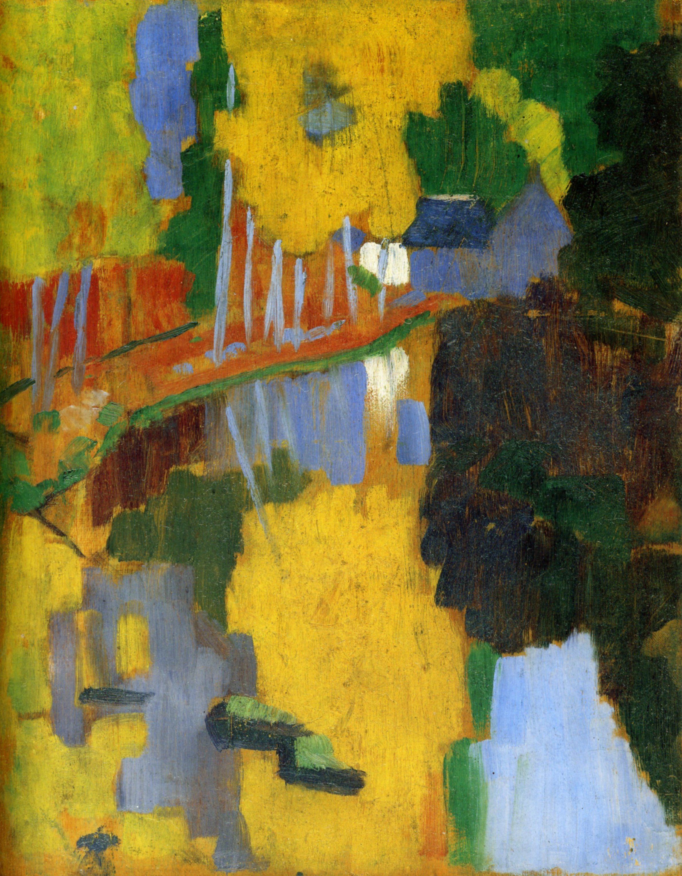
The Talisman
PAUL SÉRUSIER
Armed with only a letter of introduction from Paul Gaugin, a young 24 year old artist left Paris, heading west towards an artist commune on the Brittany coast. Paul Sérusier was determined to reconnect with nature having completed his studies in the capital, and began to paint landscapes at Port-Aven. On a walk through the idyllic countryside with Gaugin, the older artist asked Sérusier, ‘"How do you see these trees? They're yellow. So, put some yellow. This shadow, it's rather blue, paint it with pure ultramarine. Those red leaves? Put vermillion.” He listened, and this, the resulting work, changed the course of art history. Nature was represented not for its likeness but for its visual sensation, reduced to flat planes and simple colours. Tt was a conclusion to the direction the Impressionists and the first work of the ‘Nabis’, a name taken from the Hebrew word for ‘Prophets’. The name ‘The Talisman’ was given to the painting by the group, it representing the entire movement into modernity and becoming a work of holy importance.
Paul Sérusier
PAUL SÉRUSIER, 1888. OIL ON WOOD.
Armed with only a letter of introduction from Paul Gaugin, a young 24 year old artist left Paris, heading west towards an artist commune on the Brittany coast. Paul Sérusier was determined to reconnect with nature having completed his studies in the capital, and began to paint landscapes at Port-Aven. On a walk through the idyllic countryside with Gaugin, the older artist asked Sérusier, ‘"How do you see these trees? They're yellow. So, put some yellow. This shadow, it's rather blue, paint it with pure ultramarine. Those red leaves? Put vermillion.” He listened, and this, the resulting work, changed the course of art history. Nature was represented not for its likeness but for its visual sensation, reduced to flat planes and simple colours. Tt was a conclusion to the direction the Impressionists and the first work of the ‘Nabis’, a name taken from the Hebrew word for ‘Prophets’. The name ‘The Talisman’ was given to the painting by the group, it representing the entire movement into modernity and becoming a work of holy importance.